

Colour is so important. We spend hours deliberating over the colour of our new car purchase. We enjoy the experience of being served- and devouring- colourful foods. We fill our gardens and window boxes with brightly coloured flowers and glossy foliage. We also spend a lot of time deciding on which colours to paint the walls in our homes.
To celebrate the new TV ad campaign by Crown Paints, I was asked to explore the relationship of colour and your outdoor space, and more specifically the flowers you choose to grow within it. I’ll be choosing some of my favourite flowers to match with some specific colours from the new matt and silk emulsion colour charts, to tie in with the #makeyourmark promotion.
It’s not paint, it’s personal.
Many scientists believe flowers did not always represent the bright, technicolor world that we’re able to enjoy in our gardens today. Indeed, fossils show that prehistoric flowers were quite demure, and quite unlikely to get the attention of any flirtatious bees!
Those plants soon realised that they needed to evolve to attract pollinators, and hence increase their chances of survival. Bees also enjoyed the sweet nectar of the blooms! However, these days, bees have started to discriminate, and seem more attracted to blues, purples and whites. These colours are said to appeal better to the visual systems of the bee. Of course, birds also enjoy the sweet nectar and the more colourful, the more likely they’ll dive in for a feast!

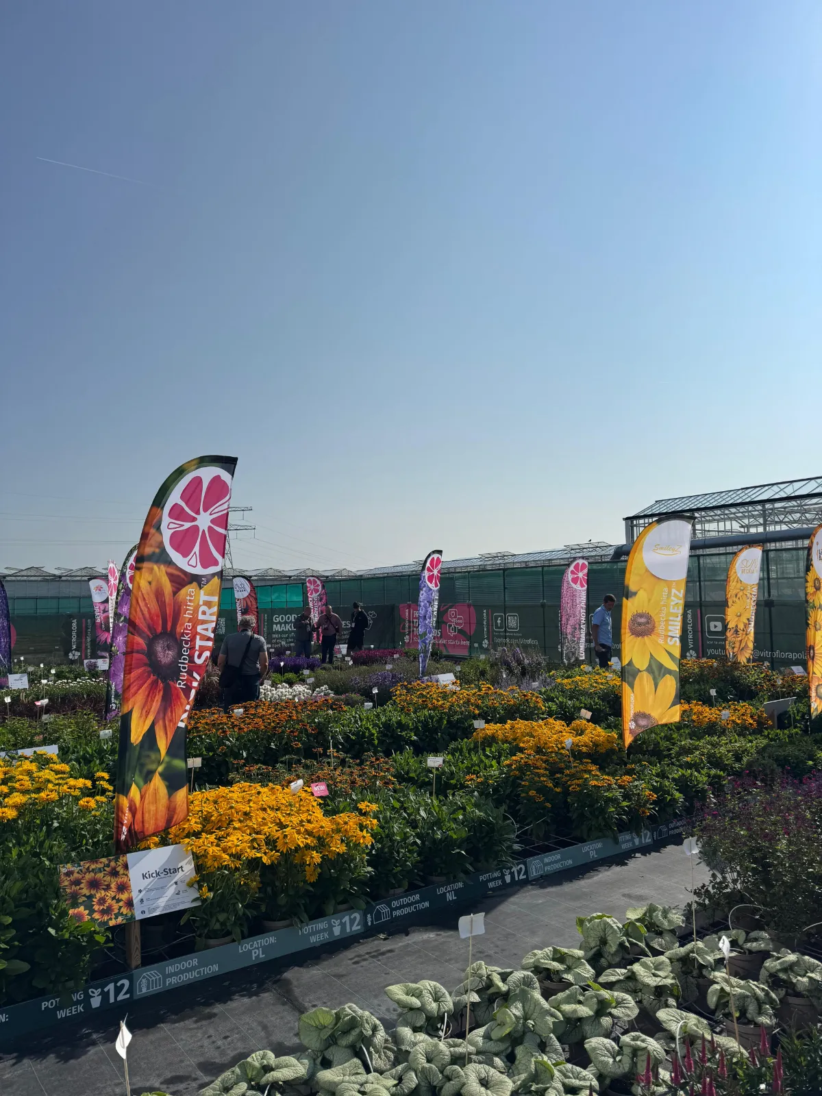
Of course, colours and fashion go hand in hand. Who can forget the psychedelia of the 70’s, or the pastel shirt trend of the 90’s? Does colour in the garden follow a fashion? Whilst the annual RHS Chelsea Flower Show may suggest it does, in my experience most everyday gardeners just tend to grow what they like the look of. Following colour trends in the garden is usually left to the garden designers.
In terms of block colours, there are some fantastic colour themed gardens at the Royal Horticultural Society’s Hyde Hall garden in England. You can see that the Head Gardener has had a lot of fun planning those borders, with a particular highlight being the red-purple border, where scarlet mingles with maroon and raspberry tones!


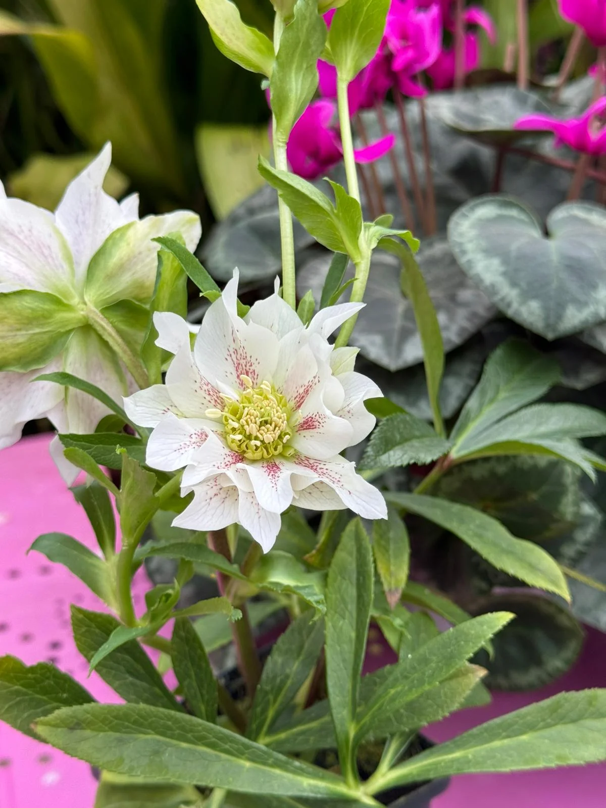
The ‘White Space’ garden at Easton Walled Gardens is also of note, even though it is devoid of colour! This border is packed with white-flowered and silver-leaved plants, and exudes a feeling of calm. In fact, the best time to view the garden is after hours, as the white blossoms shimmer in the moonlight. Some of those white blooms are fragrant only at night, in order to attract moth pollinators!

If you do want to get serious with colour in your own garden, then could always follow the sensibilities of the colour wheel, used by fashionistas the world over. But, remember you can break the rules too! At the Dutch bulb gardens of Keukenhof, I recently spotted a pink and yellow mixture of Tulips. On paper, this shouldn’t work, but in reality it was utterly glorious!

Colour in the garden doesn’t just come from flowers either. Foliage isn’t one shade of green, some can be racing green and glossy whilst others could be lime green and racy. So-called ‘variegated foliage’ often features a cream edge or marbling. The autumn colour of many plants is also quite spectacular, and can transform an outdoor space. The foliage of a Blueberry plant goes unnoticed throughout the summer, yet in October it burns bright in orange and yellow tones!

If you’re a container gardener, then you’ll want to pay particular attention to how your container matches the plants within it. Use the colour wheel to get this right. Although, I find silver zinc containers work with just about everything! You can also paint your fences with some colour, although don’t go overboard with purples and pinks, I find a gentle olive green works best as a backdrop for living plants.
Crown Paints asked me to choose 4 colours from their Matt & Silk emulsion range to explore. They also want me to match them to my favourite flowering plants. Never one to shy away from a challenge, I went for eye-popping ‘Powder Blue’, vibrant ‘Mustard Jar’, uncompromising ‘English Fire’ and calming ‘Gentle Olive’.
These colours are everything a good paint should be, and can be used in a wide range of rooms of the home. I would absolutely get the Gentle Olive splashed onto my kitchen walls to ensure a vintage vibe. Perhaps the Mustard Jar would make a downstairs toilet smile. The Powder Blue would be perfect for an upbeat bathroom, which just leaves English Fire, which I’d use as a feature wall in a study, to keep me motivated! Remember, the Matt and Silk emulsion range is provided in the Breatheasy formulation too, meaning it’s odour-free and 99% solvent-free.
Scroll down to see my chosen plants, and paints!


Leave a Reply